Graphs
Here's a running list of interesting graphs that I've come across. Where possible, I'll embed the iFrame.
AI
METR
This graph measures AI's performance in terms of the length of tasks AI can handle.
Consumer Price Index
Price Changes in Consumer Goods & Services
In this graph, we see price changes over time for a variety of consumer goods from 1997 to 2017. Any line over 0% has gotten more expensive while any line under 0% has become less expensive. What do college tuition, education, childcare, medical care, housing, and public transportation all have in common? I'll leave that as an exercise for anyone reading.
Urban CPI
This shows the CPI index from January 1947 to today.
Urban CPI (% change from 1 year ago)
Note: this is not the actual CPI value, but rather the rate of change from a year ago. Each point is generated monthly and it is looking back 12 months and calculating the percent difference between the value today and the value at that point.
Macroeconomics
Purchasing Power of one US dollar (1635-2020)

M1 – Money Stock
The reason for the discontinuity in the graph is that prior to April 24, 2020, savings accounts were not counted as part of M1. Since there were limitations on the number of transfers from a savings account, these deposits were considered less liquid than M1. However, Regulation D was amended to lift limits on the number of transfers and these holdings were considered sufficiently liquid to be counted as M1.
As of May 2020, the old M1 would have had a value of around $5 billion. The new M1 has a value of $16 billion, a substantial increase and a clear break in the time series. – "Savings are now more liquid and part of M1"
US Federal Debt as % of GDP
Federal Outlays as % of GDP
10-Year Breakeven Inflation Rate
This value backs into the expected inflation rate over the next 10 years using the 10-Year Treasury Constant Maturity Securities and the 10-Year Treasury Inflation Indexed Constant Maturity Securities.
Personal Savings Rate
This calculates the personal savings rate as a percentage of disposable personal income on a quarterly basis from 1947 to now. Over the entire time series, this averaged 9.1%. Between 2000 and before COVID this value averaged 5.9% and notably hit 26.1% during the first quarter of COVID.
Computing
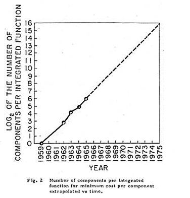
Moore's Law
On April 19, 1965, Gordon Moore published an article in Electronics Magazine in which he analyzed the number of transistors that could be placed on an integrated circuit and predicted that "by 1975, the number of components per integrated circuit for minimum cost will be 65,000" and that this large circuit would "be built on a single wafer."
Energy
[A state of war is similar] to the time wherein men live without other security than what their own strength, and their own invention, shall furnish them withal. In such condition, there is no place for Industry… and consequently no Culture of the Earth… and which is worst of all, continual fear, and danger of violent death; and the life of man, solitary, poor, nasty, brutish, and short. —Thomas Hobbes, Leviathan, 1651
Throughout human history, increasing material prosperity tended to go hand-in-hand with resource utilization. When Thomas Malthus formulated "An Essay on the Principle of Population" he noted that populations went through "oscillations" where the population would grow, outstrip its ability to materially provide for this population growth, and summarily decline.
One framing of modernity is that it began with the Enlightenment which led to the Industrial Revolution. With the Industrial Revolution, we saw technological progress begin to unshackle us from the physical confines of earth. That said, this growth came at an environmental cost. Human population went vertical and we didn't run into a Malthusian Trap, but population and resource utilization continued in lockstep.
Recently, we have seen an interesting phenomena called "dematerialization" which basically means that we've been able to consume more wile taking less (both in relative and absolute numbers) from the planet. In 2015, Jesse Ausubel wrote "The Return of Nature: How Technology Liberates the Environment" which suggested that America's economy had "decoupled" and that our economy "no longer advances in tandem with exploitation of land, forests, water, and minerals" which was expanded on by Andrew McAfee in his book More From Less.
Energy is the bedrock of our civilization and so hopefully these graphs shed some light on on both the supply (energy generation) and demand (energy consumption) side of this equation.
Per capita CO2 Emissions
Electricity Production by Source, US
Energy Intensity
Energy Consumption by Source
Energy Consumption by Source (Relative)
Solar PV Module Prices
Generation of Nuclear Energy
Capitalism & Diffusion of Technology
Share of Households Using Specific Technologies
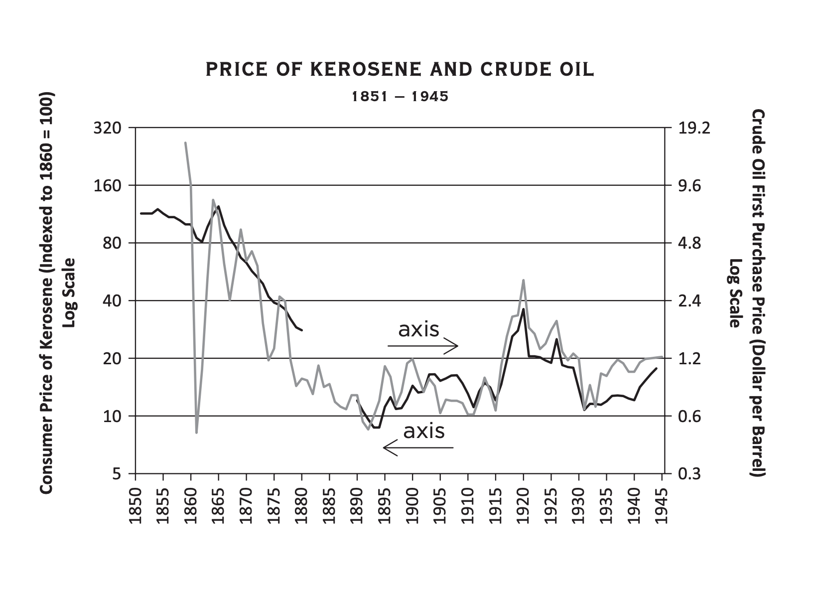
Price of Kerosene and Crude Oil (1851-1945)
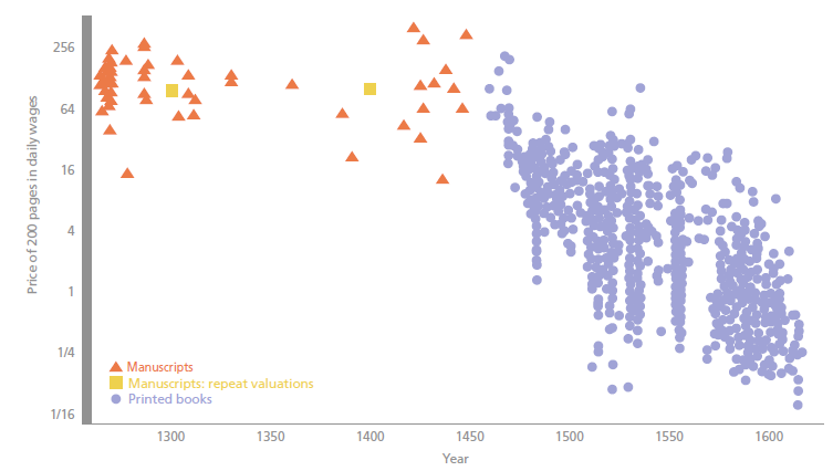
Price of Manuscripts and Printed Books
Productivity
Agricultural Productivity
Productivity-Pay Gap
Pharma
